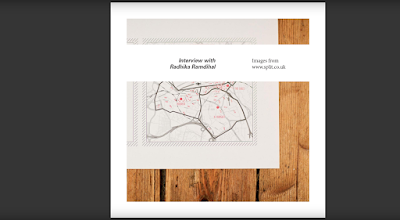
Final Design
The final design is based around the passage on Splits website, which describes what it means to be split. The concept takes influence from some of the words within the passage and their meanings. The report plays on the idea of split which is defined as; if something splits or if you spilt it, it is divided into two or more parts. A modular grid was used to create strips of white which split the imagery into two.
Another word from the passage that influenced the design was contradiction, which was defined as being a combination of statements, ideas or features which are opposed to one another. This idea of opposition and contradiction is reflected in the use of serif and sans serif typefaces. These are direct opposites with one being clean and contemporary and the other more traditional in its aesthetic. Opposition and contradiction are also reflected in alignment of text within the report. Varying left and right alignment in the questions and answers creates a reflected shape which is the reverse and opposite to the other bit of information. Having different alignments defines the negative space between them creating a split between the two lots of information. Making the questions a smaller point size than the response also plays with the idea of contradiction, in that usually headers and questions are higher in the hierarchy.


No comments:
Post a Comment
Note: only a member of this blog may post a comment.