Monday, 21 May 2018

OUGD502 - PPP Module Evaluation

OUGD502 - Module Evaluation


This module has helped me to reflect on the year and consider key parts of my practice and interests that I have. I have been able to identify themes within my work, processes and ways of working which I prefer and want to continue with. However I have also found that I have quite a varied practice but experimentation and three dimensional work is something that is used frequently within my work. I have also found that I have quite a few interests outside of Graphic Design but that are still creative. PPP has encouraged me to start thinking about how these can be incorporated more into my practice so that these different elements begin to blend into my work. 

The creative report was a difficult task mainly because not many people got back to me which was frustrating. However there were positives to this as it made me consider further avenues that I was interested in and who I could contact to get a response. Research is important when contacting people as you have more understanding about them and their work and provides a conversation starter if you show an interest in a particular part of their work. The creative report allowed me to better understand a wider variety of jobs available within the industry.    

Presenting is still difficult, however I feel that I am able to present more confidently despite still being nervous. Presenting in front of larger groups of people is more daunting, such as when we did the pitch, however this was made easier by doing it with someone else as we could bounce off one another. Having lots of images and minimal text makes a presentation more visually engaging and illustrates points better, whilst also prompting things to say. Having notes as a back up is useful if I get stuck however its best to work off the presentation. I have learnt that practicing a presentation multiple times before doing it in front of people means that you get a better sense of how long it will be and allows you to familarise yourself with the flow of the presentation and what you will say. This preparation makes a presentation look more confident and allows you to look up and talk more naturally about the topic.

This module has given me a better understanding of some of the avenues in which I could go down, whether this be starting a business, creating products or working in a studio. I have also discovered that perhaps a studio is not for me and starting a business could be interesting, however if I was to work in a studio I would be more inclined to work in a smaller one. The module has encouraged me to be open minded about what I could do creatively.

From what I have learnt about my practice and interests I want to explore these further over the Summer and in Level 6 to start developing some direction, whether this be a business or working for a studio. 

OUGD502 - Studio Brief 1 - Creative Report - Summary and What I've Learnt


Creative Report

Summary 

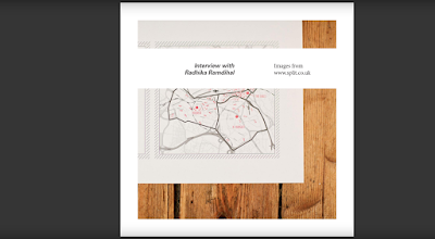
Radhika is currently working at Split Studio in Leeds as a Junior designer. She comes from a mainly Fine Art background and didn’t discover Graphic Design until her Foundation course. This Fine Art influence led her to have a very conceptual approach to her design projects in university. Whilst studying at Sheffield Hallam University she was encouraged to work on things aside from traditional Graphic Design outcomes. She has a love for books which led to many of her projects being centred around typography and language.

After university she got an internship at Split where she then got a full-time job. Split consists of four team members with Radhika working under Creative Director Oli. Split mainly creates work for clients in the creative sector with the studio specialising in print and web solutions. Radhika has worked on projects for theatre shows, film festivals and Leeds College of Music etc. At Split they don’t have a definite house style, instead they tackle projects on a brief by brief basis which allows them to consider how to best approach the design.


For Radhika she aired towards a smaller studio because she liked the personal element within this setting. Before working at Split she hadn’t had a job, only work experience and internships, so this also influenced her decision to work in a smaller studio, however she said that its personal preference and she had friends that enjoyed working at a larger agency. She suggests that having experience in different studios will allow more understanding as to what type of company is right for you in terms of size, ethics and work, whilst also filling in any gaps in your knowledge as some university courses don’t prepare you completely for the industry. In hindsight she feels she could have done more of this. She expressed the importance of asking questions about anything to do with your future and that you never stop learning new things. She said that she used to put a lot of pressure on herself, however she is gradually getting a better work life / balance through experience. The industry she says is already quite stressful so adding pressure on yourself doesn’t help, instead keeping creativity fun is important.

What I’ve learnt and relate to

Splits use of experimental processes makes their work appealing to me as it is an approach I like to use in my own work. Working on projects on a brief by brief basis and not having a studio style I can relate to as my own work varies.

From Radhika’s responses there are lots of things that I can relate to both in terms of her journey and choices. I also hadn’t done Graphic Design until my foundation which I think has led me to also have quite a conceptual and experimental approach to my work which I enjoy. She was encouraged to do projects outside of traditional graphic design briefs at university as she would be doing lots of these in the industry. Considering this, working on projects that interest me next year will be important as this will be one of the best opportunities to do so and will also allow me to understand more about what I want to do. 


If going into the industry the need for experience was made clear as it will help me get a sense of what I like and don’t, as well as teaching me new things which I may have not learnt on my degree, making me more prepared for the industry. 

Radhika chose to work for a smaller studio because it was more personal, which if I was to work for a studio, I feel I would also be more inclined towards as well. Striking a balance between work and life will be important within the industry to keep the job fun. 

Asking questions and learning as much as possible was also highlighted, this will be important while I have access to the facilities and tutors. This will benefit my development and these skills and knowledge will help for the future.

Sunday, 20 May 2018

OUGD502 - Studio Brief 2 - Colours May Vary

Colours May Vary 


Colours May Vary is an independent design shop within Leeds which has a focus on selling design publications. The shop stocks books and magazines on a range of things including graphic art and design, typography, illustration and product design. They also supply stationary, homewares and gifts. They source items locally and internationally from both new and established designers but also aim to support other independents within Leeds. The shop has an events space where exhibitions, events and workshops are all hosted.


Things that are interesting about Colours May Vary:
- There is a wide variety of disciplines covered within the shop and its publications allowing people access to a range of subjects within design and the arts and keep up to date with these. 
- The shop aims to stock things from both new designers and established which allows graduates and newcomers to be found which raises the profile of artists and designers within the city.
- Many of the things sold in Colours May Vary are quirky and playful which is engaging.
- There is a focus within the shop of supplying things that wouldn't be found elsewhere within the city which makes it a place to visit for something unique.


https://coloursmayvary.com/pages/about-us

Colours May Vary Questions


What are your backgrounds from before Colours May Vary?
What led you to opening up Colours May Vary?
Do you both have different roles within the business?
How long did it take for you to establish yourselves as a business and how have you developed?
How do you discover and source products for your shop?
When curating and sourcing products for your shop, what do you look for?
What is the toughest part of running a business like Colours May Vary?
What is the highlight of working at Colours May Vary?

Response 

Becky Palfery from Colours May Vary 

Thanks for getting back. We are actually in the process of writing up a blog post which covers nearly all these questions as we do get asked them a lot! 
We thought it might be easier to post them up. 

Basically, it is really hard work running a bricks and mortar store. It is expensive and balancing time is hard with constant visits from customers. 

If you are considering opening any kind of retail outlet be it online or a physical shop our main piece of advice would be not to copy what is already out there. Don't assume other businesses doing something 'similar' are thriving and copy what they do. 

Innovate and make a point of being different. There are a lot of stationery outlets, office supplies and similar. What would make you different? Do you have a marketing budget the size of Papersmiths? (we don't). If not don't try and compete. Carve your own niche, that could be own brand product etc. 

I'll give you a shout when we post the blog! 

OUGD502 - Studio Brief 1 - Duke Studios

Duke Studios 


Using the information on the Careers page and Start up Wednesdays it was found that there are opportunities to have work space at Duke Studios for 6 months after graduation. Duke Studios is a coworking space in Leeds that provides creative space for small businesses and creatives to work from and has a range of facilities. This could be a good stepping stone between coming from university and starting up a creative business. Also it was found that Duke Studios also provide lasercutting, vinyl and building services. This could be useful when I no linger have access to facilities at the university. Lasercutting in particular is something that I particularly enjoy using to create three dimensional work so would be useful when I've left university.  


https://duke-studios.com/workspace
https://duke-studios.com/services

OUGD502 - Studio Brief 1 - Present and Correct

Present and Correct 


Present and Correct are a stationary / design company that are online and have a shop in London. It is run by two Graphic designers Neal Whittington and Mark Smith.  They produce their own works as well as collecting vintage items from around the world and work form other designers. The shop is inspired from a love of stationary. Their work and products that they find are inspired by homework, the post office and school. Their shop aims to create a sense of nostalgia and make people look at daily objects in a different way.


https://www.presentandcorrect.com/
https://www.presentandcorrect.com/pages/about-us


Things that I like about Present and Correct:


- They balance selling their own work with things that they have sourced from other designers and vintage items. This idea of sourcing design is of interest.
- The unique and varied selection of products, particularly the vintage designs, are things that you wouldn't be able to find on the highstreet making them unique.
- The photography and composition of the items allows the products to be shown off in the best light.
- The idea of sourcing and curating unique and vintage items is appealing. Finding interesting design from different places is an interesting concept.
- Shows how vintage design has become contemporary again.
- Like the idea of selling physically functional items that have a practical use.


Possible interview questions for Present an Correct:


What led you to opening up Present and Correct?
Where did the name come from?
What drew you to vintage stationary and design?
What sorts of places do you visit to source products for your shop?
What do you look for when choosing / designing products?
Which are your most popular products?
Do you have any personal favourite products?
What type of products do you enjoy designing yourselves?
How did you decide to start a shop?

OUGD502 - Studio Brief 2 - Peg and Awl

Peg and Awl


Walter and Margaux are a couple that live and work in Philadelphia and run an online site called Peg and Awl. They create a range of products including bags, stationary, Homeware, Jewelry , Garden Accessories and one of a kind items.  Their products are made from old and reclaimed materials that they find, which they re-purpose into new products and aim to create things to be kept. 


They describe their work as being 'made from olde things, treasure found and recovered from misfortune and neglect, relics of the unusual, the confused and the macabre, cut and pulled and built into wearable curiosities, inscribable keepsakes and useable, longlasting treasures' 


They make their products in an old factory that still has original features which they describe as a place where 'histories overlap as Peg and Awl gathers new life with new makers, new personalities, and new hands'.


To create their products they find materials from 'flea markets and old shoppes, abandoned houses and torn - down buildings, construction sites, yard sales and dirty basements'. A lot of the materials they use are more than a century old. The finished products retain a sense of this history through the wear and tear of the materials they are made from. Common materials that they use are wood, leather, decoupage, fabrics, rope , metals and different finishes. The wood that they source is from old growth trees which were mostly cut down in the 1800s and turned into homes, they also scavenge wood from storm damaged trees or the local carpenter. Much of the leather that they source for their bags are made from military issue gun slings. Their decoupage designs come from antique book which they compile to create collections for their wooden blocks. They use antique fabrics from dresses, curtains, quilts and scraps, whilst their waxed canvas comes from a long lasting local company.


https://pegandawlbuilt.com/


What is interesting about Peg and Awl

- Their use of reclaimed materials to create new products brings a sense of story and meaning to the pieces. By reusing things around them they are able to create pieces that are unique and more tangible which are qualities that I am drawn to.

- The repurposing of old materials and bringing new life to these items is a technique / approach that appeals to me as it presents a challenge in how to create something new with those materials, whilst also having a positive effect on the environment. 

- Sourcing materials from a range of places adds to the excitement of the process as you may find things that you may never have thought of using.

- The use of minimal branding and packaging allows the products to be the focus.

- The qualities of the original material are maintained and embraced within pieces which gives charm and character to each piece which is appealing. 


Questions for Peg and Awl:

What are your backgrounds from before Peg and Awl?

What led you to open up Peg and Awl?
What draws you to reclaimed and salvaged materials for your products?
How long did it take for you to establish yourselves?
What is your process when developing new products?
How difficult was upscaling your business?
What is the toughest part of running a business like yours?
What is the highlight of your business?

OUGD502 - Studio Brief 1 - Creative Report - List of Emailed People

List of people emailed for Creative Report 


Name / Studio
First Contact
Questions Sent
Interview
Complete
Present and Correct
1st May


Peg and Awl
8th May


Choosing and Keeping
6th May


Papersmiths
3rd May
Yes 3rd May

Colours May Vary
8th May
Yes 8th May
Feedback Given
Cassie Hester
15th May


Mireldy Studio 
14th May
Yes 14th May

Handmade Font
11th May


Another Studio
9th May
Yes 10th May

Barry Spencer
10th May
Yes 14th May

Radim Malanic
11th May


Handmade Font
11th May


Passport Studio
11th May
Yes 14th May

Radhika at Split
11th May
Yes 14th May
Full Interview


For the creative report I contacted a variety of different people from different sectors within the industry. Many of the initial emails that were sent out were not responded to at all. Others said that they would try and answer the questions because they were busy but never responded with the answers. Initially I had around ten questions for each person however this was refined to five to make it more likely for people to respond. Having less questions also meant that they could expand on their answers. Although it was quite frustrating when people didn't respond after researching into them and choosing the for their relevance, it did mean that I had to consider other areas that I was interested in in order to get a response. 

I contacted some typographers and designers who made three dimensional / experimental type as this is something I have an interest in and have explored within COP before.

Contacted Barry Spencer, Handmade Fonts, Radim Malanic. 

Some design led shops were also contacted as I like the idea of potentially setting up my own business. The shops that I contacted were mainly design led / stationery shops as I like the functional aspect of design objects and many of these products act as creative tools for designers. Finding and sourcing products also is interesting so I wanted to find out more.

Contacted Colours May Vary, Papersmiths, Present and Correct and Choosing and Keeping.

I also contacted a few designers and studios that create three dimensional design and have a focus on making. Peg and Awl were contacted because of their use of reclaimed materials to create their functional items which is something I enjoy experimenting with. Another Studio was also contacted because of their three dimensional approach to design where they create models, pop up cards, page markers etc inspired by nature and architecture.


OUGD502 - Studio Brief 1 - Creative Report - Final Design

Final Design


The final design is based around the passage on Splits website, which describes what it means to be split. The concept takes influence from some of the words within the passage and their meanings. The report plays on the idea of split which is defined as; if something splits or if you spilt it, it is divided into two or more parts. A modular grid was used to create strips of white which split the imagery into two. 

Another word from the passage that influenced the design was contradiction, which was defined as being a combination of statements, ideas or features which are opposed to one another. This idea of opposition and contradiction is reflected in the use of serif and sans serif typefaces. These are direct opposites with one being clean and contemporary and the other more traditional in its aesthetic. Opposition and contradiction are also reflected in alignment of text within the report. Varying left and right alignment in the questions and answers creates a reflected shape which is the reverse and opposite to the other bit of information. Having different alignments defines the negative space between them creating a split between the two lots of information. Making the questions a smaller point size than the response also plays with the idea of contradiction, in that usually headers and questions are higher in the hierarchy.  


OUGD502 - Studio Brief 1 - Final Creative Report

OUGD502 - Studio Brief 1 - G . F Smith

G.F. Smith 


G. F. Smith are a paper makers who create specialty papers for print projects. Various different examples of publications were brought in to show how their different stocks could be used and the finishes that could be achieved. They supply various weights, textures, colours and qualities of papers. It was interesting to see the range of papers that they had available and how printing on to them created different effects. Many of their papers are unlike anything else on the market so their ranges will be useful for future projects as a way of adding interest, tactility and colour to my print designs.


OUGD502 - Studio Brief 1 - Glow RHS

Glow RHS


At all RHS gardens this year Glow Winter Illuminations took place. The gardens were opened after hours so that visitors could see the garden lit up with coloured lights. It was interesting to see the garden in a different way, with the use of the lights around the garden creating interesting shadows, which highlighted and emphasised the forms of the plants and trees. Lights near the pond created beautiful reflections on the water and abstract patterns. The whole event brought colour to the garden that would otherwise be quite sparse because of Winter. 


OUGD502 - Studio Brief 1 - Light Night

Light Night 

Light Night this year had a range of new light installations around the city.


The moon on the canal was the best installation of the night. Hanging the design over the canal made the water light up and reflect the moon on its surface like it would on the sea. The detail on the design was incredibly realistic and the way it floated just above the surface of the water created an almost magical atmosphere around the piece. 


Within Leeds Town Hall there was an installation that had puzzles and clues on the walls. The room was dark so the designs could only be seen through the use of a special light. I particularly liked the symbols and graphical elements in this installation as well as the interactive light element of the design which made it engaging. The puzzle aspect was also interesting as it meant people had to engage with the piece to find out the answer. 


This piece was within Leeds City Museum. It consisted of plastic cups with lights within. These were controlled using a program on an Ipad. People would interact with the Ipad, moving their finger across the screen, which would then light up different areas of the installation creating different patterns and colour combinations. The installation would light up in a new way for each individual and I liked the uniqueness of each interaction.