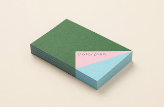
G. F Smith Branding
- Within G. F Smiths branding the main focus is placed on the papers and their versatility.
- The use of the different papers duplexed and combined with one another creates a playful and bright visual identity that uses their product as the basis for the design.
- Text within all of their designs is kept to a minimum allowing the quality, colour and texture of the papers to be the focus of the design, whilst also creating a premium, refined and quality feel to the branding.
- Each business card has a different combination of papers creating a sense of uniqueness as well as highlighting the papers adaptability and different combinations they can be used in.
Things taken from this:
- Like the minimal approach to the design of the branding with the focus being on the materials themselves. Perhaps a similar idea could be used within my own personal branding however I could use different materials that are appropriate to my own practice, which would highlight the importance of materials and experimentation within my practice. Keeping my own design quite simple would allow the materials and this idea to be clear. Using different materials in this way would also allow my branding to become quite playful but still refined which I think would work well in representing my work and process.


No comments:
Post a Comment
Note: only a member of this blog may post a comment.