Friday, 3 November 2017

OUGD502 - Studio Brief 1 - Guest Speaker - Group Skype Call - Greta Madline

Greta Madline


Greta is a Graphic Designer who graduated from Leeds College of Art a few years ago and is currently at The Kennedys (part of Wieden + Kennedys) in Amsterdam. She got chosen after applying four times however her perseverance paid off and she got a place this year. For her application she sent a box of work she made purely for the application to make her stand out. She said putting effort into communication often pays off. She said is there are people / designers that you like then research them and write to them make it personal. When contacting someone its best not to think about it just send the email or send something to them.


In Amsterdam she found it hard initially settling in as it can be hard to adapt, get to know other people and know whats happening. She said the experience so far had be exciting especially when everything is paid for so she could immerse herself in the creative side and at The Kennedys anything goes making it a creative accelerator for those on the project.

She said one of the things that she misses from the college was the facilities. She encouraged us to do what we wanted to do, experiment and do weird stuff while we were there. Having your own passions and finding new things was also important. Things she didn't like in college she loves now. 

After leaving university she said it difficult to adjust because she didn't feel she knew what she was doing or how she fitted into the 'industry' however she said it was important to make your own path and to trust your gut feeling, 'You do You'. She said that creativity in general can be used for anything. She suggested that it can be hard not to have an ego but said it stops you creating good work and that keeping work to yourself doesn't help.
She said it was important to fight for your ideas however when people are young they don't have much confidence so often don't.  
She said it can be hard work being creative and doesn't get easier however without work you can't get anywhere.

Greta's top tips:

You don't have to do one thing 
A lot of people specialise into one thing but she didn't and loves doing everything.

Create your job 
Deciding what you want to to do is important and if the job doesn't exist you can make it yourself.

Question everyone

Be silly 
Think about the work you want to do outside of university and do it.

Don't be an ass

Just relax a bit
Think about that moment in time and be in the moment.

Whatever you do, make it golden
In any project look for personality or characteristics to make it better.

No one knows
No one ever knows what they are doing.

Stay Golden 


Things learnt from Greta:

- By communicating with people in an exciting way makes you stand out. Making it personal is more likely to interest someone.
- It's fine not know what precisely you want to do or how you fit in the industry. Even doing something else is completely fine as you can / will make your own way to do what you want.
- The importance of making work that you have an interest in and taking the opportunity now to experiment and have fun as much as possible.

Tuesday, 24 October 2017

OUGD502 - Studio Brief 1 - Raum Exhibition - Curation of the Exhibition

Raum Exhibition - Curation Team 


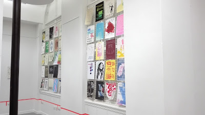
Raum was an exhibition at Leeds Central Library of first and second year work celebrating past, present and future events within Leeds.

As part of the main exhibition team myself and Georgia were put in charge of the curation of the exhibition, meaning we had to lead a team to measure, organise and put up the work, making the space ready for the public.


We had to measure all aspects of the room from which I then made a drawn plan. From this we were able to calculate the wall area we had to work with and how many pieces of work would fit roughly on the spaces given. We had to work in conjunction with the vinyl / wayfinding team as they would need to know the length of the room to create an appropriate sized timeline which all the work would be ordered by. Taking pictures of the space also allowed other to understand what the space was like.


Talking to staff at Leeds Central Library allowed us to find out where things could be hung as only certain board space could be used. Also  nothing was allowed on the floor for health and safety etc, all these factors had to be taken into consideration and we had to adapt to the restrictions of the space, both before and during installation. 


For the layout of the exhibition work was to be ordered chronologically in a timeline which was specified by the design team. The curation team had to work out the best place to put the timeline as it would have to run around the room in a straight line undisturbed. Placing it a little below the grills meant it was not too low down and could continue around the room.

All the pieces were ordered chronologically and into their century sections to make it easier to put them up on the day. However on the day of installation this had to be adapted, most of the pieces were portrait with only a few landscape which was problematic when trying to create columns of work. The landscape designs were therefore put at the end of each section to avoid ruining the flow of the work. Annual events were put into the year that they started rather than their own category, to fit with the catalogue.


For the curation of the exhibition we had to decide how the work would be mounted and source and buy materials, whilst being cost effective. Originally it was discussed that we would use orange bulldog clips and panel pins for all of the work, to fit with the colour scheme of the branding. However this was very expensive for that specific colour so used bulldog clips on the grills and panel pins on the walls.


When the exhibition was put up tags were created to go along side each work to show the event and name of designer. These were placed along the timeline directly beneath the column the poster was in. The tags were chronologically arranged to match the layout of the posters. When putting up the work the posters had to be rearranged multiple times to get the spacing and layout right around the room, which meant delegating areas to different people and organising the work.


Things learnt:

- Being a leader of a team means having to delegate to get everything done. Making best use of everyone and spreading the work equally means things get done quicker.  
- If something doesn't get done then as the leader you have to step in and come up with a way of getting it done.
- Planning as much as possible before the event makes it easier on the day e.g. ordering all the works.
- Being able to adapt to circumstances and problem solve is important e.g. on the day we had to rearrange things multiple times to work with the space.
- When setting up an event you have to take into consideration the restrictions of the space e.g. where things can be hung, health and safety etc.
- Taking into consideration costs is important. Originally we were going to have orange bulldog clips for all the prints to correspond with branding, however this would have been too expensive. Instead panel pins were used on walled surfaces and mixed coloured bulldog clips on the grills to create a celebratory feel and colourful look. 

OUGD502 - Studio Brief 1 - Pat Bradbrary Workshop Day 2

Workshop Day 2

The group concept for the story revolved around a blue character who was always sad and followed by clouds.

When the blue character comes into the scene his clouds cover the sun making the other characters hide away, making him lonely and confused. One character comes out to speak to him making the blue character happy and the clouds disappear. This makes the rest of the characters come out and everyone is friends.

To create the piece the characters and some parts of the scene were individually moved, with pictures taken after each movement. The large series of images were put into Photoshop to create a GIF.  

Things learnt:
- Making sure the camera was in the same place for every shot was important to create a consistent background scene 
- Collating and ordering all the best images into another file was important, making it easier to put them all into Photoshop and make the GIF 
- Moving the characters around by small increments meant that the movements within the animation look more natural, rather than jumpy.


OUGD502 - Studio Brief 1 - Pat Bradbury Workshop - Day 1

Workshop Day 1 

Part 1 

Pat Bradbury is a illustrator / graphic artist who primarily works in an abstract way using collage, textures, markmaking etc. His experimental approach to creating work is process driven and often includes layering pieces up to create a final piece. He also teaches and does workshops. 

We were given a series of quick tasks to complete which would give us a body of work to use later on. In one task we were given a word given a word which we had to drawn this as many times as possible which was difficult at first as once the obvious things were out of the way you had to be more creative in your representation, leading to some abstract forms. The continuous line drawing task meant we had to close our eyes then draw the things that were said to us without lifting the pen from the page. It was interesting to see which sections looked like representations of what we had heard and how they created new forms despite being something else.
Another task was to write a stream of consciousness for a minute then give the outcome to the next person who had to create marks, drawings or symbols for the content  

From the marks we created we had to then recreate them in different materials and textures. We were encouraged to experiment with materials and drawing material to create new textures. 


Transferring some of the line drawing shapes onto neon paper, then cutting them out with an outline made them stand out because of the bright colours. Gestural mark making with drawing materials on paper created new material to work with, from which the symbols could be cut out, creating a more organic, textural feel.


Using  white wax crayon to recreate some of the marks with a colour wash over the top, made the white stand out. Drawing around the marks emphasised the forms more, although from a distance the pen dominates meaning its less obvious how the piece was actually created.  


Using multiple washes sometimes became slightly muddy where the watercolour overlapped etc. They were more striking when the colours are more vibrant e.g. orange and yellow.  


A exciting effect was created by using wax crayon marks with a wash of colours over the top in certain areas, then spray painting over this and wiping away the spraypaint. When the spraypaint was wiped from the damp, colour washes it lifted the spraypaint revealing the wash underneath. The patterns of the washes were created when the wax repelled the water wash creating patches around the rough wax crayon marks.


Part 2 

After Part 1 we formed groups and discussed what was interesting with the materials we had all created. We had to focus on one aspect and run with it. There was an emphasis on making a physical thing e.g. product, three dimensional sculpture, packaging, album art etc.

Hazel had put eyes on one of her marks making them look like a children's character. We suggested that we continue to do this with a variety of other marks.  Adding eyes gave the marks personality, the shapes became bodies and features for the characters. 

It was suggested that we could make a three dimensional world for them however this was more effective when we collaged on the wall with the materials we had as we were able to create a more intricate design. By creating a 2D world it created context for the people.  


To create the world we used different materials,textures and marks to reflect different environments, e.g. the branch like structures from the wax drawings created a forest with the green paper.


Cutting simple shapes out of paper then layering them over other textures worked well in creating a mirrored pond and sky.


Adding a foreground of leaves created the impression of looking through a jungle at the world beyond, giving a sense of perspective to the scene. 


As another task we had to use materials to frame our work. By cutting out shapes and rolling paper up, then taking pictures through this, it created the sense that you were using binoculars to see the characters in the distance.


Thoughts for Day 2 

Using the piece that we had created we had to think how we could take it further for Day 2. It was suggested that we create a stop motion story with the characters. Having the piece collaged on the wall meant that the characters would be able to be moved easily and photographs would be taken of their movements. All the pictures would then be turned into a little animation. 


Interesting ways of working from the workshop:

- Having a a short amount of time to do the tasks was initially daunting however made you think quicker and more abstractly.
- Showed that material can be created from very basic sources, even just individual words
- Working with the same content in different medias creates widely different outcomes
- It was surprising how, from such basic scrap material, different environments and characters could be suggested to make up a world. 
- Photographing a work in different ways can impact the overall perception of the piece.
- The addition of eyes to the characters brought the basic shapes to life and made them look like recognisable animals.

OUGD502 - Study Task - Reflection on Summer

Summer Reflection


Visiting friends around the country meant I was able to see other cities such as Newcastle, Liverpool, Alnick and Edinburgh. While doing this it was good to spend time doing and seeing other things especially in cities where I had not been before. From this it was considered that I perhaps worked too hard last year and that I wanted to try and have a better work / life balance during the year, leaving more time to visit and do things that I like during the year. To do this, setting dates for when I want to see or do something will help me to work around and towards these goals.

After visiting Edinburgh again during the summer, where there is an amazing mix of old and new and there is always something new to find, I would at some point like to possibly live or work there.

Visiting Gardens etc for my Wildlife Gardening, Summer Project was particularly enjoyable because it was something I was interested in already and I was excited to do the project on something that I wanted. The project also included having to collect photographic research which allowed me to focus on nature photography which is something I have done a lot of in the past. Within my own work this year I want to continue doing more projects that are on subjects that I have an interest in such as nature and also bring more photography into my work.

Going to a salvage show over the summer was enjoyable because its interesting to work out how old materials can be re-purposed to make new things. Recycling reclaimed materials to create something 'new' and functional with life already, is an interesting concept and means that everything made with salvaged materials is completely unique. Going to the salvage show always provides me with new materials to create products with for my Etsy account. Through this I have found that designing and making objects with reclaimed materials provides a challenge as you have to rethink how things can be used, however is rewarding because you are putting something to use again. Physically making things and working with materials in a Product Design sense is exciting.   

Thursday, 30 March 2017

PPP - OUGD402 - Module Evaluation

Module Evaluation 


During this module, it has been really useful to listen to guest speakers to see how they present and what type of work they produce. This has given me a better insight into the range of ways you can go into the industry, whether this be part of an established studio or setting up myself. When listening to the professionals it was also reassuring to see that they found it just as difficult as us to present, but people are usually very understanding when listening to you.   
  
Throughout the year, it has been made clear that you don’t necessarily have to become a graphic designer, instead as creatives we can apply our skills to anything if we want. This has been quite a fresh outlook which has been reassuring, especially when I am still working out what I want to do.

In terms of presenting I found it particularly useful to have tasks that built us up to the final presentation, as this made the process easier and I had a better understanding of what worked. Also, these tasks allowed me to better understand aspects of my process which ultimately helped me to present how I had developed over the year. When putting together a presentation I have found that having a structure by combining themes and using title pages allows the presentation to flow better and makes it easier to talk alongside. I have found that having full spread images and minimal text engages the viewer and the use of self-branding within the presentation helps to emphasis you as a creative. Having notes particularly for the last presentation, which was much longer helped me to keep track of where I was, however, because I had these it also meant that it was easier to look down at them, which affected my projection and eye contact with the listeners.

The self-branding project was initially very difficult as it was hard to pinpoint what I wanted to be known for especially when I am still unsure what I do or want to do. It was also difficult to create something that made you stand out without feeling awkward and to be objective about something so close to you. Once I found that I had an idea it was best to just go with I, rather than overthink whether it was the best way to represent me. By picking one point it allowed me to better focus how I was going to portray the idea.  Through the project, I discovered how for me process, technique and materials are particularly important to my practice and that learning new approaches to work excites me.


Next year I want to free up time to visit more things outside college and do my own projects, as well as working more three dimensionally. The summer will allow me more freedom to explore things that I am interested in whilst also maintaining my design skills.  

Wednesday, 29 March 2017

Art from Non - Art Workshop

Daniel Gee from the Goat Collective


Collage artists that were shown:


Beth Hoeckel 
Hort - uses simple geometric shapes with a heavy focus on distorting faces 
Robert Rauschenberg - more famous for his paintings however he also worked in mixed media
Dr Me - most well known for there 365 day collage project which has brought the medium back into mainstream design
Ill Studio - work across mediums not just collage  
Louis Reith - combines black and white imagery with geometric forms 
Ellery James Roberts - is predominantly known as a musician but creates his own album covers 
Leif Podhajsky - uses brightly coloured textures and landscapes and digitially manipulates them 
Mat Maitland - creates images for fashion and product photography
Richard Prince - well known for getting into trouble over copyright issues
Ventral is Golden - branded Belgrave music hall and are a Leeds based studio 
John Stezaker - seen as a forrunner in his style of collage that many have copied since 


Tips for collage :

- Use tape to stick images down so that pieces can be rearranged if you work out a different arrangement.
- Suggests not to use anything that has artistic value in order to prevent copyright issues and to change images.

Appropriation - Collage uses found imagery to create something new 

Art from Non - Art Exhibition Submission by 3rd April
Works will go into an exhibition and some chosen to go into a book


Studio Brief 3 - Design Strategy Presentation

Final Presentation Slides including notes used for the Presentation


- Learnt new approaches to tackling design 


Research
Importance of research – without not meaningful
Dictionary definitions - meaning of words – simplifies idea or theme – more abstract visualisations – multiple meanings – different viewpoints 


Theories 
Frutiger's theory of shapes – useful in wayfinding project  – psychology behind shapes is interesting – how we perceive them -  simple but meaningful - all done subconsciously


Production Methods – different materials – not always able to access digital print -  DIY – make best of the situation – resourceful – create interesting things - problem solving important 


Sketchbooks – structure work – computer lose and forget what you've done – better able to visualise what I am doing – easier to talk about work 


Restrictions – way of generating ideas -  provides structure gives something to work with - techniques used as restrictions - grids – minimal shapes – collage – photography  - consistent aesthetic –not over-complicating – stronger concept – working with same material


Logotype and typeface design

-         learnt about the anatomy of type and meaning / perceptions of typefaces
-         and how useful this can be in graphic design
-         like the structure that comes with typography provides a format that everyone knows – put own spin on it 


Object
-         expanded idea of ‘research’
-         primary information collected through studying the object
-         new perspectives on the subject
-         created more obscure work


Penguin Book Design
-         like book design
-         can be quite abstract in interpretation of book  - work was metaphorical
-         working to a live brief exciting – see what it’s like in real life 


Self Branding
-         used materials that reflected the physical properties of parts of my process – e.g. restrict shapes, list post it notes
-         logo – squiggle that used in notebook to define something of interest, inspiration / designer, important
-         noted references similar concepts, look at , interesting , acknowledgement
-         fits well with the logo and where it came from


Inspiration
-         Collections of typography , offcuts , found imagery etc – find lots of things day to day around you – range of different styles otherwise might not look at
-         Crits – feedback given me areas to look at – would not have thought of – sometimes get caught up in work – don’t see good or bad


To improve
-         Blogging - starting to be more to the point– writing post it notes has allowed more focused writing – still need to keep ontop of it better
-         Research –bogged down in information can get a little overwhelming –  refine things to useful stuff –beginning of a project
-         Difficult starting a project – not knowing what to do - don’t force it too much – feel like wasting time when not knowing what to do – do something else can help spark something – not great if under pressure though


Year 2
-         Animated work – Dr Me 
-         3d work – workshops -  Use the workshops more for crafting things
-         Personal projects – more live briefs  
-         Confidence in colour and combining elements 


Comments on the layout of the presentation:

- My self branding squiggle logo was used as a way of identifying and drawing attention to key points
- When images were used these were full spread to make it visually engaging 
- Text was kept to a minimum so that people were listening rather than reading   
- By breaking my presentation into sections / themes this helped it flow and made it easier for me to know what I was talking about


Feedback on presentation:

Overall the presentation went well and kept to time, it was said that the use of my logo throughout the presentation would be effective in promoting myself and that a lot of professionals use this technique on slides that do not have full images. When looking at other peoples presentations I found that the most engaging were ones with lots of images. Although I had images for most of my slides I could have used more to show a greater variety of what I have produced.