Raum Exhibition - Curation Team
Raum was an exhibition at Leeds Central Library of first and second year work celebrating past, present and future events within Leeds.
As part of the main exhibition team myself and Georgia were put in charge of the curation of the exhibition, meaning we had to lead a team to measure, organise and put up the work, making the space ready for the public.
We had to measure all aspects of the room from which I then made a drawn plan. From this we were able to calculate the wall area we had to work with and how many pieces of work would fit roughly on the spaces given. We had to work in conjunction with the vinyl / wayfinding team as they would need to know the length of the room to create an appropriate sized timeline which all the work would be ordered by. Taking pictures of the space also allowed other to understand what the space was like.

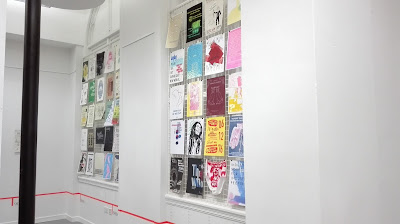
For the layout of the exhibition work was to be ordered chronologically in a timeline which was specified by the design team. The curation team had to work out the best place to put the timeline as it would have to run around the room in a straight line undisturbed. Placing it a little below the grills meant it was not too low down and could continue around the room.
All the pieces were ordered chronologically and into their century sections to make it easier to put them up on the day. However on the day of installation this had to be adapted, most of the pieces were portrait with only a few landscape which was problematic when trying to create columns of work. The landscape designs were therefore put at the end of each section to avoid ruining the flow of the work. Annual events were put into the year that they started rather than their own category, to fit with the catalogue.

For the curation of the exhibition we had to decide how the work would be mounted and source and buy materials, whilst being cost effective. Originally it was discussed that we would use orange bulldog clips and panel pins for all of the work, to fit with the colour scheme of the branding. However this was very expensive for that specific colour so used bulldog clips on the grills and panel pins on the walls.
When the exhibition was put up tags were created to go along side each work to show the event and name of designer. These were placed along the timeline directly beneath the column the poster was in. The tags were chronologically arranged to match the layout of the posters. When putting up the work the posters had to be rearranged multiple times to get the spacing and layout right around the room, which meant delegating areas to different people and organising the work.
Things learnt:
- Being a leader of a team means having to delegate to get everything done. Making best use of everyone and spreading the work equally means things get done quicker.- If something doesn't get done then as the leader you have to step in and come up with a way of getting it done.
- Planning as much as possible before the event makes it easier on the day e.g. ordering all the works.
- Being able to adapt to circumstances and problem solve is important e.g. on the day we had to rearrange things multiple times to work with the space.
- When setting up an event you have to take into consideration the restrictions of the space e.g. where things can be hung, health and safety etc.
- Taking into consideration costs is important. Originally we were going to have orange bulldog clips for all the prints to correspond with branding, however this would have been too expensive. Instead panel pins were used on walled surfaces and mixed coloured bulldog clips on the grills to create a celebratory feel and colourful look.


No comments:
Post a Comment
Note: only a member of this blog may post a comment.